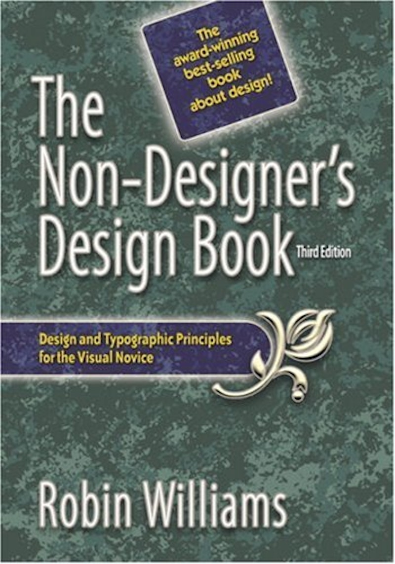
So many people with graphics-design capability and so little clue what to do with it. That, in essence, was the desktop publishing revolution until a designer named Robin Williams brought The Non-Designer’s Design Book into being. The book’s third edition includes a chapter on color. If you’re an amateur and want to try design, you might as well buy Ms. Williams’ book and save yourself some trouble. Non-Designer does a first-rate job of nailing down and illustrating the few simple commands needed to redirect our brains toward creation of coherent graphic designs, designs that don’t make people want to look away.
“Coherent” is the key word there. Would-be designers tend to work by feel. Williams teaches you to analyze: “You must notice details, you must try to state the problem in words.” She steers you clear of endless mistakes by laying out the basic principles of what makes a page work.
The page’s purpose is to supply information, and it does so graphically by grouping items according to what sort of information they give the reader. Similar items are grouped together: the lecture hall’s address, phone number, and URL over here, the dates and topics of individual lectures over there. All the items have their edges—upper or lower, left or right—aligned with those of the items they resemble and with the page as a whole. Not only that but the items are aligned with the same part of the page: the page’s left side, its right side, possibly the center (if you want a sedate look).
Once this structure is set, it is dressed up and enlivened by contrast and repetition. The eye is given visual footholds, so to speak, so it can sort out the information more easily, and the mass of data takes on a collective visual personality. At best this collective effect may jump off the page, which is what the feelers-along tend to be looking for—the moment of ignition. Non-Designer’s goal is more modest. It guides you to that special moment when, because you haven’t done something stupid, you can look at the page and see a viable, nailed-together design looking back at you.
If a design gets those corners aligned, gets the information rolling up as needed, makes sure the visual data can be slotted without trouble, then a bit of look and flair have their place. But first things first. Williams doesn’t say this, but most people who look at a graphic care less about aesthetic thrills and more about their eye’s subliminal comfort and their brain’s itch to have information sequences completed. That’s why it doesn’t matter to me that some of the designs Williams did for her book seem a bit lackluster. Most design isn’t really an occasion for falling in love, just for simple gratitude.
The Non-Designer’s Design Book walks you through the color wheel (I had no idea it was that simple), the various sorts and uses of type (“If you have trouble seeing what is wrong with a combination of typefaces, don’t look for what is different between the faces—look for what is similar”), and the basics of designing newsletters, business cards, and flyers. The book even recaps the act of learning itself, its whys and wherefores. “Once you can name something, you’re conscious of it,” says the first chapter. “You have power over it. You own it. You’re in control.”
I think that last accomplishment is the sign of a superior how-to author, one who is determined to get results. Yes, somebody buying a how-to book ought to know why learning how-to is a good idea. But a lot of us don’t. We get the books because the money outlay feels like a commitment to a goal and therefore a step toward achieving it. That Williams can see this delusion of ours and cope with it shows she has the empathy demanded of great teachers. The result is The Non-Designer’s Design Book, and I’m all in favor of it.

